Making a Mark
Branding should tell a company’s story
Branding a business involves much more than arriving at a name and a symbol. It goes way beyond placing a mark on a steer.
A branding effort may comprise numerous touch points, ranging from a website to print advertisements, billboards, TV spots, social media — even golf shirts and company forms.
In total, says Rachel Cazares, a multimedia designer at Compass Marketing & Consulting in Tallahassee, the brand should reflect a business’ history, personality, product or service, customers and reputation.
The brand is an encapsulation of a company’s story.
“It’s not just something that you can slap on the side of a truck,” Cazares says. “You are creating a visual representation of who you are. I begin by gathering as much information as I can about a company and its operations — why it is in business, the market for its products or services and who its customers are.
“You wouldn’t pick out paint colors for someone’s house without seeing the place and knowing something about the homeowner.”
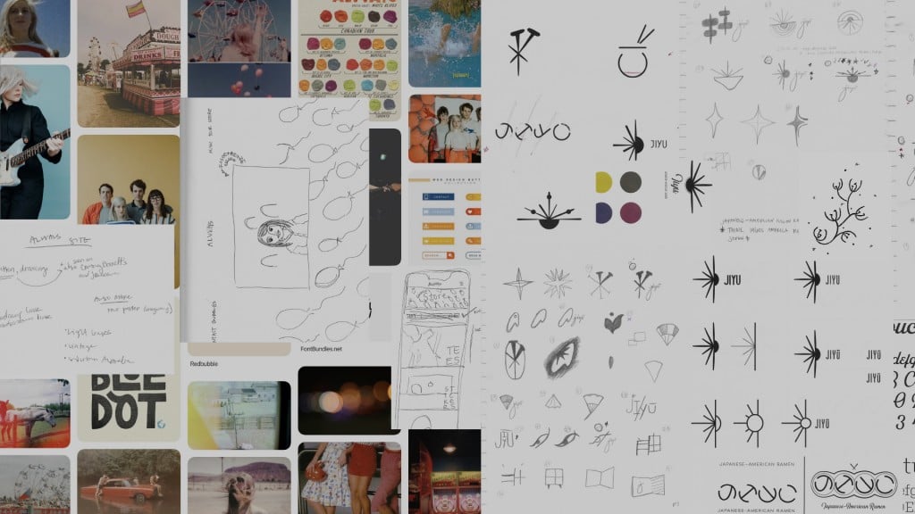
Once company stakeholders are consulted and research is complete, it is time to start thinking visually. Cazares often takes a look at the branding efforts of other companies who share the space occupied by her client company and then considers how the client can be presented in ways that highlight what makes it different and better.
Cazares commences rough sketching and assembles alternative “mood boards” that present the client with options as to the brand pattern, colors and typefaces.
The process, she says, should be consultative. She avoids building out a branding campaign and presenting it to a client as a fait accompli. Intermediary steps let the consultant know she is moving in the right direction.
By presenting three distinctive boards — any one of which she believes would work if chosen — Cazares empowers the client with the freedom to make choices and makes the client an integral part of the work.
Color is, of course, a fundamental choice, and one dictated to an extent by the nature of a business’ product or service line. Pink or purple may not be an appropriate color for a carpenter.
And, said Cazares, it is important to think about where and in what forms a chosen color or colors will appear. In the digital world, the options are limitless. When it comes to putting ink on paper or a T-shirt, press capacities may come into play, and there may be up-charges for a custom Pantone color.
Individual colors differ in terms of their energy, mood and connotations, all characteristics to keep in mind.
Compass Marketing, for example, associates itself with electric green and gray. Cazares finds that those colors are complementary and that the bright green suggests bright ideas and passionate people.
When it comes to that cherry on top, Cazares said, customer demographics and expectations are significant. Some customers may be open to an abstract logo; others may prefer one that is readily interpreted.
There is a tendency many times to try to do too much with a logo. Businesses, Cazares says, should choose a design that will hold up at a small size when, for example, it is embroidered on a shirt or printed on an invoice. And, it may be advantageous to arrive at a logo of a timeless quality versus one that is tied to a trend of the moment.
The benefits of minimalism in logo design also extend to website design in an era when impressions must be made immediately.
All of a brand’s touch points, Cazares summed up, should be consistent with one another and reinforce each other — from posters and pamphlets to ballpoint pens and Facebook posts.
“That’s really the purpose of a brand,” she says. “Remove the logo from an ad, and still you should be able to recognize whose ad it is.”
Compass Marketing
1711 Capital Circle NE, Tallahassee, FL 32308 | (850) 878-3370 | CompassMAC.com