Color’s impact on productivity in the workplace
Which color do you think makes employees more productive?

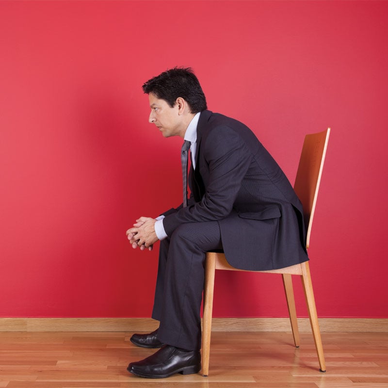
Have you ever noticed that most casual dining establishments have a similar color scheme? That’s no coincidence, my friends. That is the outcome of a well-thought out plan to bring more bodies through the door and more money into the register.
While you sit and admire the vibrant red on the walls or the rich, Espresso wood adorning every booth, the managers and owners are raking in the dough. That’s because you are inadvertently falling victim to their trap: Seduce the customer with color, and watch them eat, drink and spend.
The Spectrum of Color
Color is everywhere and impacts nearly every aspect of our lives. From the orange sun peaking over the water at dawn to the blackened twilight sky; the stark white of a hospital emergency room to the soft purples and yellows on the labor and delivery floor.
“Color is a visual clue. It evokes an emotion that is tied to a memory,” said Brad Ertzberger, an interior design professor at Florida State University and junior designer at Bass and Bass LTD in Tallahassee.
Every color has a meaning, a feeling, an emotion, which is why it is crucial that businesses choose the right hues inside and outside the office.
“Colors have color associations, and these are important to remember so that you elicit the appropriate response or feeling from your customer,” Ertzberger said.
What’s Your Color?
Remember the mood rings that were all the rage back in the 1980s and ’90s? As corny as they may have been, there was a bit of truth to their findings. Each color elicits a feeling, a response from each person. White is seen as clean. Red is stimulating. And black is elegant. These are just a few examples, but there is a whole list of them.
The popular Disney show Imagination Movers utilizes bright colors to get the attention of even the youngest viewers. However, the show’s character, Mr. Knickknocks, is a stark contrast to that. He has a boring wardrobe made up completely of beige-colored items. Everything about him is bland.
And, according to Stacy Ward, the city hall in Freeport, Fla., is the Knickknocks of the town. Ward works as a billing clerk for the city and says her beige-colored office is about as exciting as a cardboard box.
“Beige is just … when you have nothing else to look at, and you just have those plain beige drab walls, it’s just prison-like,” she said.
The 44-year-old has worked for the city for about five years. She started as a meter reader, enjoying long days outdoors. But an injury landed her on desk duty, forcing her to spend copious amounts of time inside.
“It’s a little depressing when you don’t have anything to look at to rest your mind for a moment,” said Ward. “It’s very different being inside. It makes for a longer day.”
In contrast, Ward’s daughter Jessica Anderson loves being inside at work. The 25-year-old is a fourth grade teacher at Maude Saunders Elementary in DeFuniak Springs. Her classroom has one blue wall, which helps bring color into the room. But Anderson takes it upon herself to add lots of other bold colors and posters to keep the room exciting and stimulating.
“I feel like it’s engaging for the students, that it will help them work,” said Anderson.
But it’s not just for the students. Anderson said she herself would get bored with the room and her job if she had to work in a colorless room, so she redecorates every year to keep everyone’s creative juices flowing.
“Bright to me makes me happy and makes me want to be somewhere, and if I use bright colors, my students will want to be in my room,” said Anderson. “That’s why I use bright colors.”
Bringing the Outside In
Back when farms were prevalent and white-collar workers were few, it was easy to get a tan and some Vitamin D. In fact, colors dictated nearly everything from the time the bright yellowy sun woke you up, to the blue water in which you fished, to the green of the fields you plowed and the deep navy hues of the evening sky — your cue to call it quits for the day. Color has been dictating our lives for centuries.
But now the majority of us spend our days inside under artificial light, and we crave the colors our ancestors enjoyed while working from sun up to sun down.
So how can we bring the outside in and make our workspace a more productive place all around? Ertzberger says it’s in the color.
“Choosing appropriate colors, combined with proper lighting, lowers sick leave and absenteeism and ensures that non-wage labor costs decrease in the medium- to long-term,” he said.
In a December 1999 study done by Nancy J. Stone and Anthony J. English at the University of Hawai’i at Hilo (UH Hilo), a red office was found to invoke vigor, anger and tension — but it was also a greater stimulation and increased performance. A blue office was found to cause depression, sadness, fatigue and relaxation. A white office elicited more headaches and bouts of nausea.
Ertzberger says other studies show that white is the least favored color for an office and that a light-blue-green color is most preferred.
If given her way, Stacy Ward would bring in purples and yellows to brighten her workspace.
“I love the lavender. I would go with a hint of purple and maybe some sunflowers in the background. Maybe some pictures in the background, you know that would brighten my day. Or, maybe daisies. Daisies are good too,” she said.
The Psychology Behind the Color
According to Wikipedia.org, color psychology is “the study of color as a factor in human behavior,” and it plays a big part when it comes to the way the human mind perceives and processes the information it receives.
Psychology.about.com calls it “a powerful communication tool that can be used to signal action, influence mood and cause physiological reactions” and says certain colors can raise blood pressure, increase metabolism or cause eyestrain.
“In China, red is the color of luck, while in Nigeria and Germany it means the exact opposite,” states Wikipedia.org.
Water coolers are all but extinct in the workplace, but employees still enjoy gathering together to chat about their day, their family and the gossip in the office. And, while a little down time is arguably a good thing, allowing workers to relax their bodies and minds for a few minutes here and there, every employer knows it comes down to dollars and cents.
So how do you keep the employees happy AND productive? Ertzberger says it’s all in the environment. He says bright, vivid or saturated colors stimulate the brain while muted pastels and greys promote a feeling of rest. Therefore, you want to incorporate the latter in your decorating to bring out the productive side in all.
Colors and the Customer
Colors aren’t just geared toward the employees working at the store, though. They are also an important factor when it comes to drawing in the ideal crowd for your business.
“I think the most important thing to understand is what image you are trying to portray and making sure that the colors and color schemes that you choose reflect your brand and elicit the appropriate response or feeling from your customer,” Ertzberger said.
One of the best examples, according to Ertzberger, is McDonalds, which uses bright red and yellow to excite and stimulate its customers to get them in and out quicker. In a lounge-type setting, though, Ertzberger says you would want darker, more soothing colors to entice your customers to relax and enjoy. Still other businesses, like a law firm or bank, he says should utilize a more mature, stable palate with blues, greens and browns.
Color — or a lack thereof — is everywhere we turn, and it’s something we can use to our advantage, if we know how. It can help excite students to new ideas and lessons, fuel employees to be productive while on the clock and convince customers that your business is the place to be.

![Istock 2161417091 [converted]](https://wpcdn.us-midwest-1.vip.tn-cloud.net/www.850businessmagazine.com/content/uploads/2026/03/x/e/istock-2161417091-1024x576.jpg)
